Apple Retail Sales Analytics
1M+ sales transactions across 75 stores worldwide, loaded into DuckDB and analyzed to uncover which products actually sell, which stores lead the pack, and whether warranty claims tell us anything useful about product reliability.
Hint: Tap on any chart in this report to expand it full screen.
Table of Contents
- Project Overview
- Dataset Summary
- Data Pipeline & Setup
- Exploratory Data Analysis
- Sales by Launch Year
- Top 10 Highest Sold Products
- Top 10 Lowest Sold Products
- Top 10 Months by High Sales
- Top 10 Months by Low Sales
- Top 10 Stores by Highest Sales
- Top 10 Stores by Lowest Sales
- Top 3 vs Bottom 3 Countries
- Warranty Claims Deep Dive
- Top 10 Products with Highest Warranty Claims
- Top 10 Products with Lowest Warranty Claims
- Warranty Claims by Year
- Repair Status Distribution
- Key Business Takeaways
- Tools & Technologies
Project Overview
This project takes a raw Apple retail sales dataset from Kaggle and turns it into something useful.
The raw data (5 CSV files, 1M+ rows) was downloaded, validated for nulls and duplicates, then loaded into a DuckDB analytical database with proper schema design and foreign key relationships. From there, SQL queries powered the entire analysis, with Pandas handling the data manipulation and Matplotlib/Seaborn doing the heavy lifting on visualizations.
What was done:
- Downloaded the dataset programmatically via Kaggle Hub and validated data integrity (zero nulls, zero duplicates across all tables)
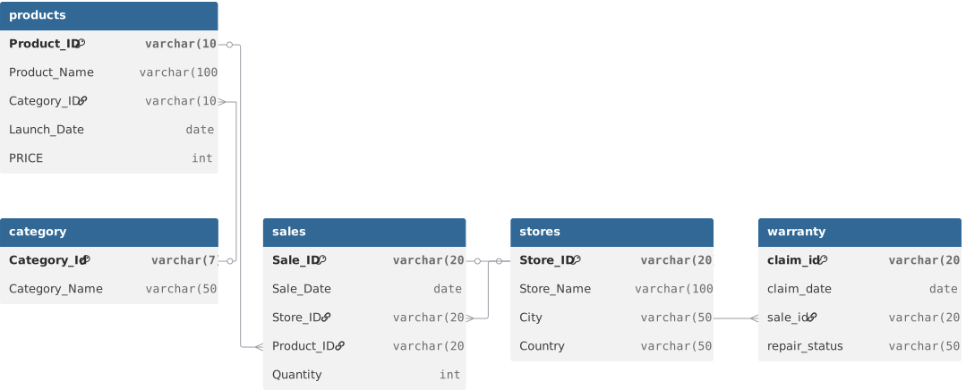
- Designed and built a relational schema in DuckDB with 5 tables (category, products, sales, stores, warranty) and proper data types
- Fixed the
sale_dateformat fromDD-MM-YYYYstrings to properYYYY-MM-DDdates usingpd.to_datetimebefore loading into DuckDB - Ran targeted SQL queries joining across tables to analyze product performance, store-level sales, geographic patterns, and warranty claim distributions
- Built 12 visualizations using Matplotlib and Seaborn that surface the patterns hiding in the numbers
No overengineering. Just clean data, solid SQL, and charts that tell the story.
Dataset Summary
| Attribute | Detail |
|---|---|
| Source | Kaggle - Apple Retail Sales Dataset |
| Total Sales Records | 1,040,200 transactions |
| Warranty Claims | 30,000 claims |
| Products | 89 Apple products across 10 categories |
| Stores | 75 stores across 19 countries |
| Categories | Laptop, Smartphone, Tablet, Audio, Wearable, Desktop, Accessories, etc. |
| Sales Date Range | 2020 - 2024 |
| Warranty Claims Year | 2024 (all 30,000 claims) |
| Data Quality | Zero nulls, zero duplicates across all tables |
Schema
Data Pipeline & Setup
The raw CSV files were clean out of the box. No missing values, no duplicated rows. That said, the sale_date column in the sales data was stored in DD-MM-YYYY string format, which needed conversion to proper datetime before loading into DuckDB.
Pipeline flow:
Kaggle Hub download → CSV validation (Pandas) → Date format fix → DuckDB schema creation → COPY data into tables → SQL analysis → Visualizations
Notebooks (run in order):
| Notebook | Purpose |
|---|---|
basic_preprocessing.ipynb |
Downloads dataset from Kaggle, copies to project, validates schema/nulls/duplicates |
load_data_duckdb.ipynb |
Creates DuckDB database, defines all 5 tables with proper types, loads CSVs |
data_analysis.ipynb |
Full EDA with SQL queries, joins, aggregations, and 12 visualizations |
Exploratory Data Analysis
Sales by Launch Year
| Year | Total Quantity Sold | YoY Change |
|---|---|---|
| 2020 | 1,481,647 | Baseline (highest) |
| 2021 | 1,155,110 | -22.04% |
| 2022 | 964,901 | -16.47% |
| 2023 | 1,093,874 | +13.37% |
| 2024 | 1,025,812 | -6.23% |
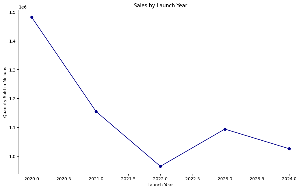
2020 was the clear peak year with 1.48M units sold, and that number has never been matched since. 2021 and 2022 saw consecutive declines, which together brought the total down by about 35% from the 2020 high. 2023 showed recovery with a 13.37% bounce back, but 2024 slipped again by 6.23%.
The interesting part: despite the fluctuations, the overall range is relatively tight. The worst year (2022 at 964K) is still 65% of the best year (2020 at 1.48M). There's no catastrophic collapse happening, just natural sales cycles that likely correlate with product launch timing.
Top 10 Highest Sold Products
| Rank | Product | Total Qty Sold |
|---|---|---|
| 1 | Apple Watch Series 7 | 65,739 |
| 2 | HomePod | 65,623 |
| 3 | Apple Watch Series 9 | 65,481 |
| 4 | iPhone 13 Pro Max | 65,465 |
| 5 | iPad Pro 12.9-inch | 65,311 |
| 6 | iMac with Retina Display | 65,252 |
| 7 | Leather Case for iPhone | 65,229 |
| 8 | Apple Watch Hermes | 65,206 |
| 9 | HomePod (2nd Generation) | 65,173 |
| 10 | MacBook Pro 16-inch | 65,104 |
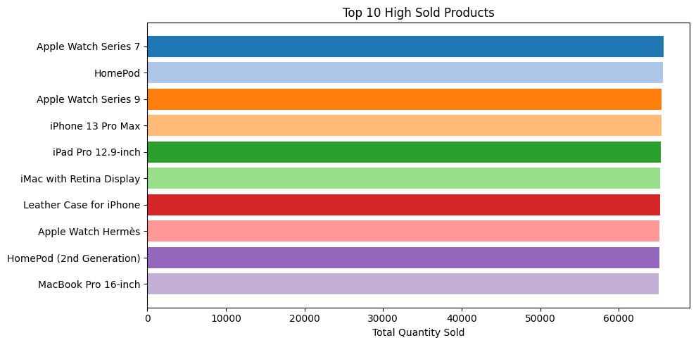
What stands out here is how tight the range is. The gap between #1 (Apple Watch Series 7 at 65,739) and #10 (MacBook Pro 16-inch at 65,104) is only 635 units. That's less than a 1% difference across the entire top 10. No single product is dominating the leaderboard with a massive spike.
The product mix is also diverse: wearables (3 products), smartphones, tablets, desktops, accessories, speakers, and laptops are all represented. Apple's sales aren't riding on one category.
Top 10 Lowest Sold Products
| Rank | Product | Total Qty Sold |
|---|---|---|
| 1 | iPhone 12 Pro | 62,772 |
| 2 | iMac Pro | 62,790 |
| 3 | Apple One | 62,924 |
| 4 | Apple Watch Series 8 | 63,306 |
| 5 | Magic Keyboard | 63,344 |
| 6 | Beats Powerbeats Pro | 63,396 |
| 7 | Apple Pencil (1st Generation) | 63,467 |
| 8 | MacBook Air (M2) | 63,479 |
| 9 | Beats Solo Pro | 63,487 |
| 10 | MacBook Air (M1) | 63,491 |
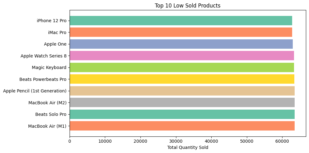
Here's where it gets interesting. The average sales for the top 10 highest sellers is only 3.49% higher than the average for these bottom 10. That's a remarkably narrow gap for a product catalog spanning 89 items.
The bottom sellers aren't failing products either. iPhone 12 Pro sits at #1 lowest with 62,772 units, which is still 95.5% of the top seller. These are established products that just happen to sell slightly less. No disaster products, no complete flops.
Top 10 Months by High Sales
| Rank | Month | Total Quantity |
|---|---|---|
| 1 | Sep 2020 | 323,160 |
| 2 | Jan 2020 | 259,044 |
| 3 | May 2024 | 258,155 |
| 4 | May 2020 | 254,483 |
| 5 | Jun 2022 | 194,249 |
| 6 | Nov 2023 | 193,382 |
| 7 | Jan 2021 | 193,298 |
| 8 | Jun 2023 | 192,930 |
| 9 | Nov 2022 | 192,831 |
| 10 | May 2021 | 192,342 |
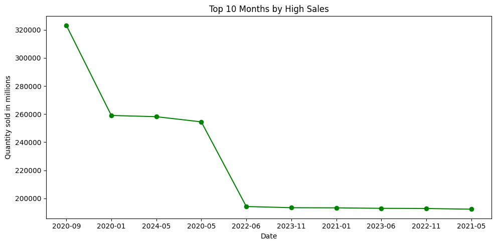
September 2020 dominates everything else at 323,160 units, likely driven by a major product launch window. The drop from #1 to #2 is steep at about 20%, and the high-performing months overall show an average decrease of 5.14% from one rank to the next. This tells us the top months aren't clustered tightly; there are clear spikes followed by a spread.
Also worth noting: 2020 takes 3 out of the top 4 spots, which aligns with it being the highest sales year overall.
Top 10 Months by Low Sales
| Rank | Month | Total Quantity |
|---|---|---|
| 1 | Dec 2020 | 63,396 |
| 2 | Nov 2021 | 64,035 |
| 3 | Mar 2022 | 63,597 |
| 4 | Apr 2022 | 64,063 |
| 5 | Jul 2022 | 63,306 |
| 6 | Oct 2022 | 63,879 |
| 7 | Feb 2023 | 63,975 |
| 8 | Jul 2023 | 63,751 |
| 9 | Mar 2024 | 63,890 |
| 10 | Sep 2024 | 63,589 |
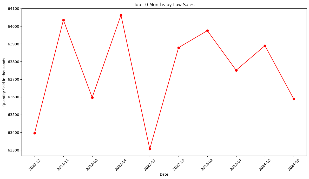
The low-performing months tell a completely different story. The average change between ranks is just 0.04%. That's essentially flat. Every single month in this bottom 10 falls in the 63,306 to 64,063 range, a total spread of only 757 units.
This consistency is actually a good sign. It means there's a stable floor of around 63K-64K units per month that Apple can count on regardless of what's happening with launches or seasonal patterns. The downside doesn't get worse; it's the upside that varies.
Summary of monthly patterns: - Low-performing months: Highly stable, with an average change of just 0.04% between ranks - High-performing months: Less stable, with an average decrease of 5.14% from rank to rank
Top 10 Stores by Highest Sales
| Rank | Store ID | Store Name | Total Sales |
|---|---|---|---|
| 1 | ST-56 | Apple Southland | 77,795 |
| 2 | ST-34 | Apple Fukuoka | 77,787 |
| 3 | ST-1 | Apple Fifth Avenue | 77,689 |
| 4 | ST-30 | Apple Dubai Mall | 77,571 |
| 5 | ST-24 | Apple Kurfuerstendamm | 77,532 |
| 6 | ST-39 | Apple Taipei 101 | 77,518 |
| 7 | ST-75 | Apple Beijing SKP | 77,482 |
| 8 | ST-25 | Apple Schildergasse | 77,385 |
| 9 | ST-5 | Apple SoHo | 77,186 |
| 10 | ST-52 | Apple Chadstone | 77,170 |
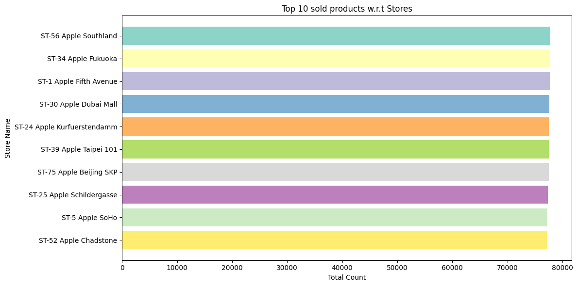
The top stores are geographically diverse: Australia (Southland, Chadstone), Japan (Fukuoka), USA (Fifth Avenue, SoHo), UAE (Dubai Mall), Germany (Kurfuerstendamm, Schildergasse), Taiwan (Taipei 101), and China (Beijing SKP). No single country dominates the top 10.
The range is tight again. Apple Southland leads at 77,795 and Apple Chadstone is at 77,170, a difference of just 625 units (0.8%). These stores are performing at nearly identical levels despite being on different continents.
Average sales across the top 10: 77,512 units.
Top 10 Stores by Lowest Sales
| Rank | Store ID | Store Name | Total Sales |
|---|---|---|---|
| 1 | ST-68 | Apple Champs-Elysees | 73,893 |
| 2 | ST-64 | Apple Andino | 74,545 |
| 3 | ST-22 | Apple Piazza Liberty | 74,864 |
| 4 | ST-40 | Apple Causeway Bay | 74,965 |
| 5 | ST-21 | Apple Passeig de Gracia | 74,977 |
| 6 | ST-7 | Apple Beverly Center | 75,010 |
| 7 | ST-51 | Apple Sydney | 75,065 |
| 8 | ST-60 | Apple Antara | 75,117 |
| 9 | ST-66 | Apple Orchard Road | 75,198 |
| 10 | ST-13 | Apple Walnut Street | 75,364 |
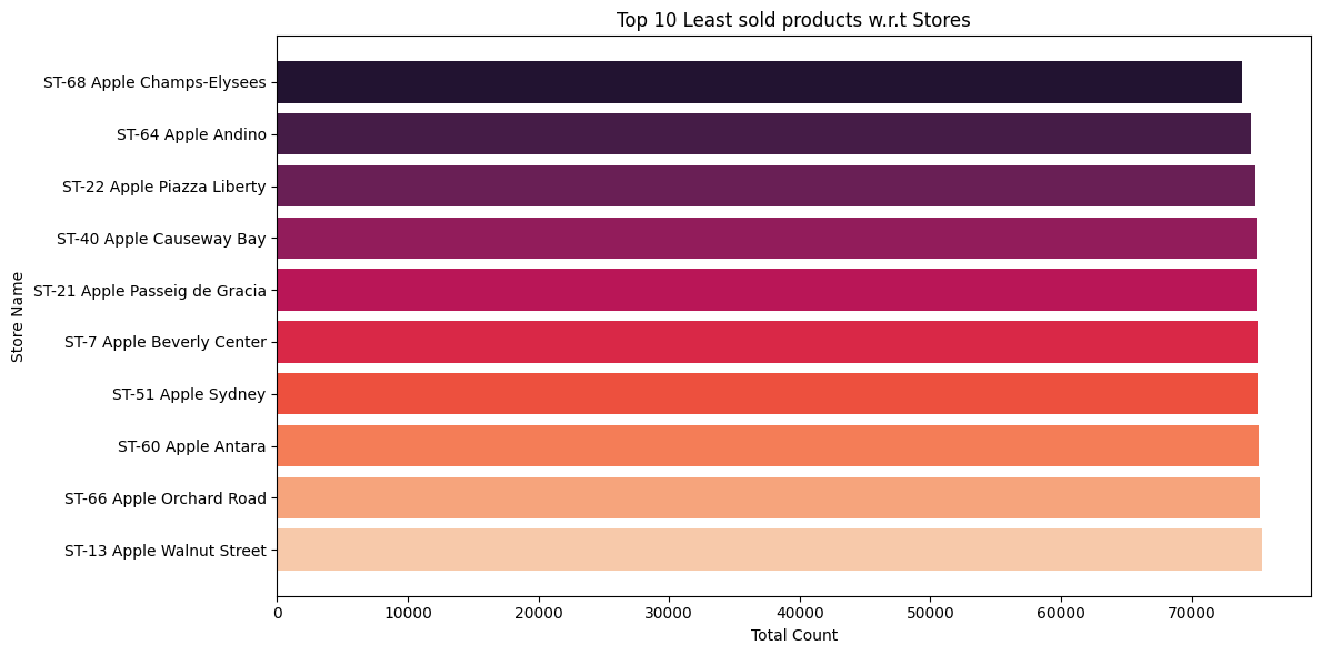
Even the "worst" performing stores aren't far behind. Apple Champs-Elysees (Paris) sits at the bottom with 73,893 units, which is still 95% of the top store's total. The gap between the best and worst store in the entire dataset is roughly 3,900 units.
Average sales across the bottom 10: 74,900 units. That's only 3.49% lower than the top 10 average (77,512). This confirms that Apple's retail network performs remarkably evenly across locations. There are no standout underperformers dragging down the numbers.
Top 3 vs Bottom 3 Countries
| Rank | Country | Total Sales |
|---|---|---|
| Top 3 | ||
| 1 | United States | 1,144,783 |
| 2 | Australia | 535,623 |
| 3 | China | 534,345 |
| Bottom 3 | ||
| 17 | Netherlands | 76,764 |
| 18 | Austria | 75,965 |
| 19 | Spain | 74,977 |
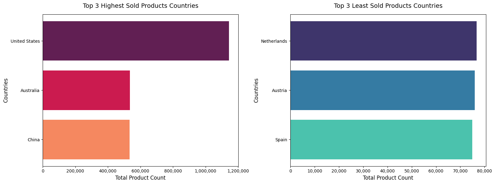
This is where the distribution gets uneven. The top 3 countries average 738,250 units while the bottom 3 average just 75,902 units. That's an 872.64% difference.
The United States alone accounts for over 1.14M units, more than double Australia (#2) and China (#3) combined. This makes sense given the concentration of Apple stores in the US (the dataset includes stores in New York, San Francisco, Chicago, Los Angeles, Portland, Cupertino, and other major cities).
The bottom 3 (Netherlands, Austria, Spain) each have roughly 75K-77K units, which likely reflects having fewer stores in those regions rather than lower per-store performance.
Warranty Claims Deep Dive
Top 10 Products with Highest Warranty Claims
| Rank | Product | Total Claims |
|---|---|---|
| 1 | MacBook Pro (Touch Bar) | 381 |
| 2 | iPhone 13 Pro Max | 372 |
| 3 | Beats Fit Pro | 370 |
| 4 | Smart Cover for iPad | 370 |
| 5 | Apple TV+ | 368 |
| 6 | Apple Watch Series 9 | 367 |
| 7 | iPhone 13 Pro | 367 |
| 8 | MagSafe Charger | 366 |
| 9 | HomePod | 365 |
| 10 | iPad mini (6th Generation) | 362 |
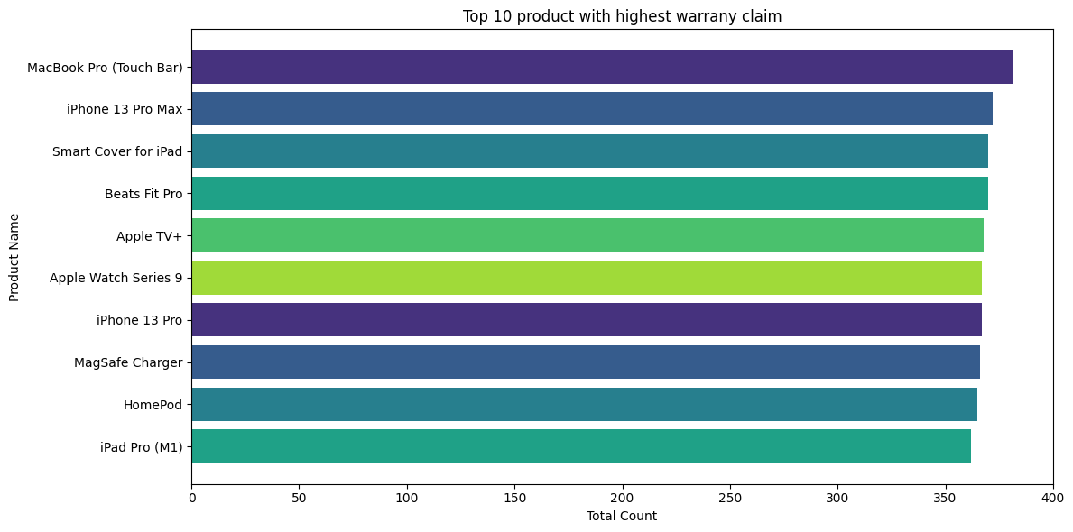
The highest claiming product (MacBook Pro Touch Bar at 381) to the 10th (iPad mini at 362) shows an average rank-to-rank decrease of just 0.56%. The drop from #1 to #2 is only 2.36%. There's no single defective product causing a massive spike in claims.
If one product had a serious manufacturing defect, you'd see something like 1,500 claims for that product and 370 for the rest. That's a 75% drop. Instead, the entire top 10 is bunched within 19 claims of each other. This is a sign of even distribution, not a quality control failure.
Top 10 Products with Lowest Warranty Claims
| Rank | Product | Total Claims |
|---|---|---|
| 1 | Smart Keyboard Folio | 297 |
| 2 | Magic Keyboard | 298 |
| 3 | Apple Watch SE | 302 |
| 4 | Apple Fitness+ | 302 |
| 5 | Apple TV 4K | 304 |
| 6 | Beats Solo Pro | 305 |
| 7 | iPad Air (5th Generation) | 309 |
| 8 | Apple TV (3rd Generation) | 309 |
| 9 | AirPods Pro | 309 |
| 10 | AirTag | 310 |
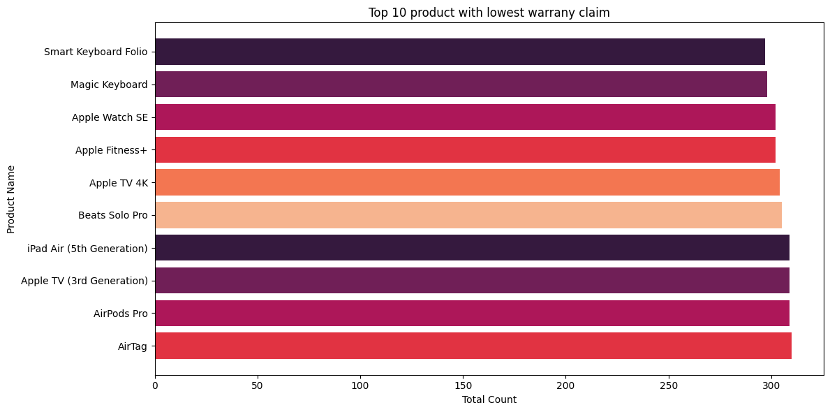
The lowest claiming products show an average rank-to-rank change of just 0.48%. The numbers are extremely close: 297, 298, 302, 302, 304... These products span keyboards, watches, streaming devices, headphones, and tablets. Reliability isn't limited to one lucky category; it's broad.
Comparing both tables:
On average, the top 10 high-warranty products generate only 21.12% more claims than the bottom 10. That's a relatively narrow gap for a catalog of 89 products. The high-claim table confirms there are no defective "disaster" products. The low-claim table confirms there's a broad, reliable catalog where many different products consistently maintain low repair rates.
Warranty Claims by Year
| Year | Total Claims |
|---|---|
| 2024 | 30,000 |
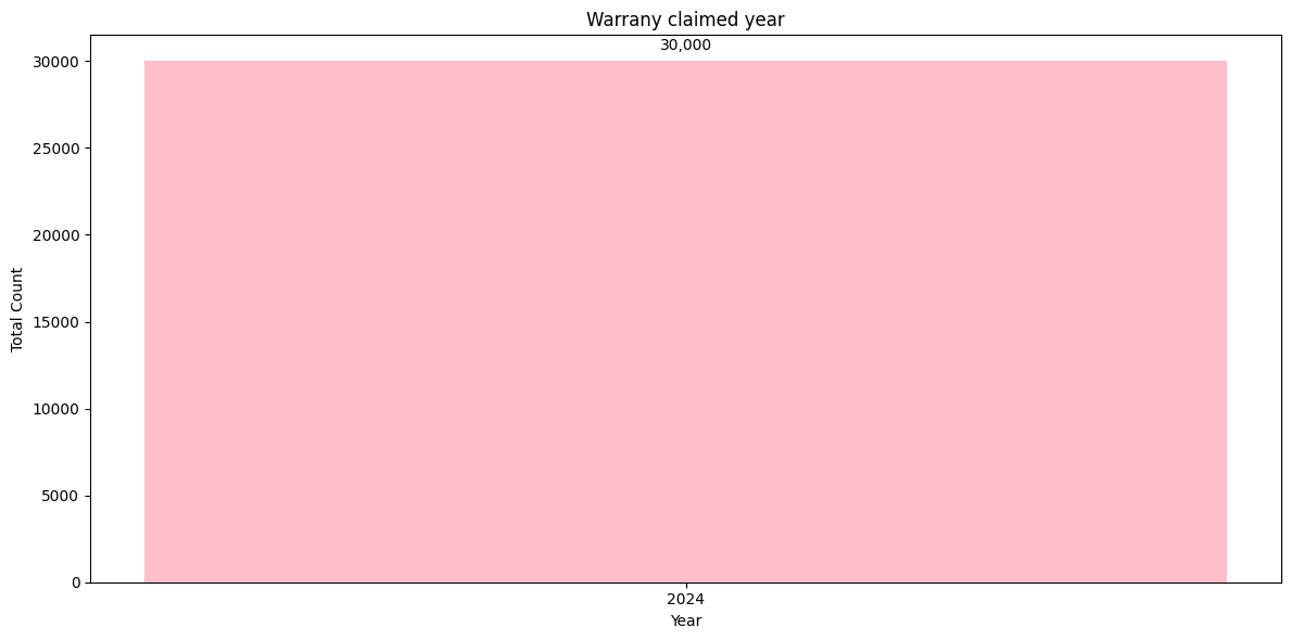
All 30,000 warranty claims in the dataset fall in 2024. This means the warranty data captures a single year snapshot rather than a multi-year trend. Keep this in mind when interpreting the warranty analysis: it reflects 2024 claim behavior only, covering products sold between 2020-2024.
Repair Status Distribution
| Status | Count | Share |
|---|---|---|
| In Progress | 7,611 | 25.4% |
| Pending | 7,566 | 25.2% |
| Completed | 7,466 | 24.9% |
| Rejected | 7,357 | 24.5% |
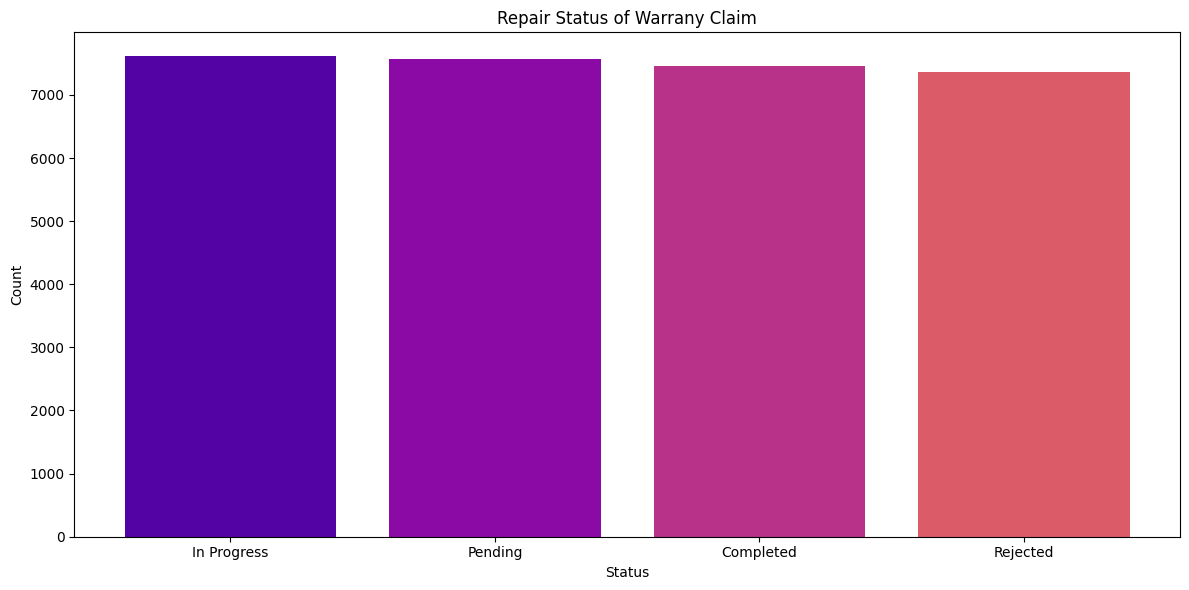
The repair statuses are almost perfectly evenly distributed across all four categories. The split ranges from 24.5% (Rejected) to 25.4% (In Progress), with a total spread of less than 1 percentage point.
This suggests the warranty processing pipeline handles claims uniformly. No single status bucket is overloaded, which means the repair workflow isn't bottlenecked at any particular stage.
Key Business Takeaways
1. The Product Catalog Is Remarkably Balanced
The gap between the best-selling and worst-selling product is only about 4.5% (65,739 vs 62,772). No single product carries the business, and no product is a dead weight. This reduces risk since the company isn't dependent on one hero product.
2. 2020 Was the Peak, and It Hasn't Been Matched
With 1.48M units, 2020 remains the high-water mark. Every year since has underperformed relative to it. 2023 showed recovery (+13.37%), but 2024 slipped back. Understanding what drove 2020 (was it a product launch cycle? pandemic-related demand?) could inform future strategy.
3. The Sales Floor Is Stable
Low-performing months hover at 63K-64K units with only 0.04% variation between ranks. This gives the business a reliable baseline to plan around. The upside varies month to month, but the downside is predictable.
4. Geographic Revenue Is Heavily Concentrated
The US alone moves 1.14M units, nearly 2x Australia and China combined. The top 3 countries average 872% more sales than the bottom 3. While store-level performance is even, country-level performance is not. Expansion into underrepresented markets could unlock growth.
5. Stores Perform Evenly Across Continents
The best store (Apple Southland, 77,795) and worst store (Apple Champs-Elysees, 73,893) differ by only 5%. This suggests that Apple's store operations, training, and customer experience standards are consistent globally. The variance comes from market size, not store quality.
6. No Product Has a Warranty Problem
Warranty claims are evenly distributed. The highest claiming product (381 claims) is only 2.36% above the second highest. There are no manufacturing "disasters" and the reliability is broad across categories, from keyboards to watches to headphones.
7. September Is the Money Month
September 2020 alone generated 323,160 units, 25% more than the next best month. This aligns with Apple's annual product launch cycle (typically September). Concentrating marketing spend and inventory around this window makes business sense.
Tools & Technologies
| Tool | Purpose |
|---|---|
| Python | Core language for all data processing and analysis |
| Pandas | Data loading, validation, type conversion, merging datasets |
| DuckDB | Embedded OLAP database for SQL-powered analytics on 1M+ row tables |
| SQLAlchemy + duckdb-engine | Database engine interface for DuckDB integration |
| Matplotlib | Primary visualization library (bar charts, line plots, horizontal bars) |
| Seaborn | Statistical color palettes and enhanced chart aesthetics |
| Jupyter Notebook | Interactive development environment for the full pipeline |
| Kaggle Hub | Programmatic dataset download and versioning |
Analysis conducted on a real-world retail sales dataset sourced from Kaggle. All numbers reflect actual query outputs from the data.